Unleashing Ion Interactive's potential
Despite offering powerful marketing analytics tools, Ion Interactive users completely bypassed them and heavily relied on Customer Support to pull reports. I led the end-to-end UX research and product design to fix the underlying disconnect.
By developing an intuitive self-service experience, we shifted 100% of accounts to direct data access while reducing overall CS support effort by 58%. Here's how we did it.
The problem
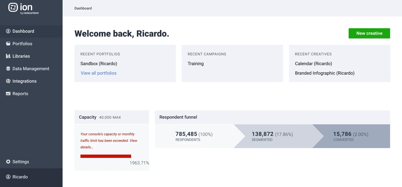
When a marketing manager wanted to know how her latest campaign was performing, she emailed her account manager and waited. Two or three days later, a PDF landed in her inbox with last week's numbers in a format she couldn't customize and couldn't share without reformatting.
The platform she was paying for had a full analytics engine behind a menu she'd never clicked, because nothing in the product surfaced it.
The pricing model made things worse. Customers paid based on content pieces created, not features used. Power users were penalized for doing more. Casual users had no incentive to explore. Low feature adoption, high CS dependency, and a revenue model that worked against engagement.
Research
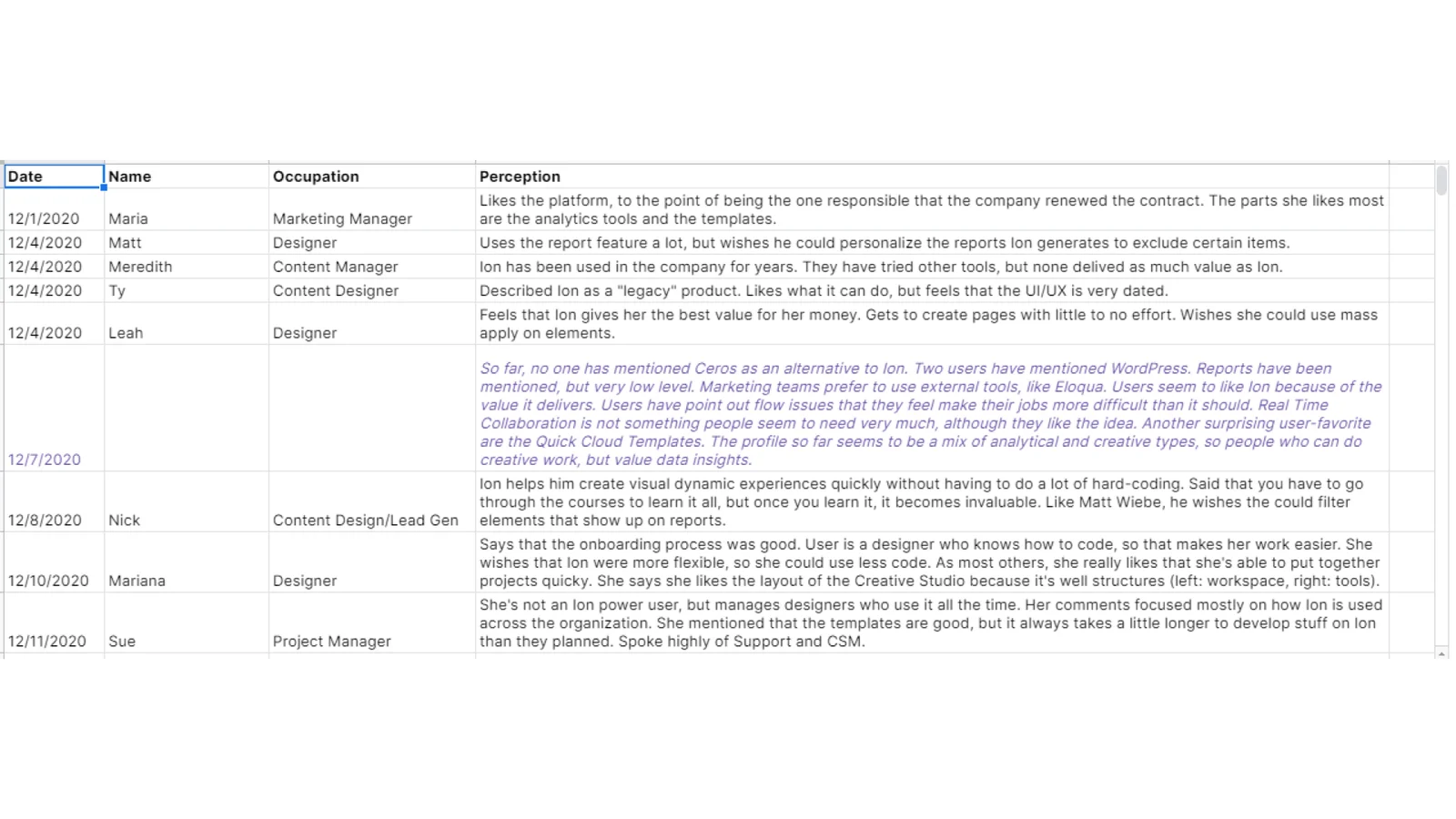
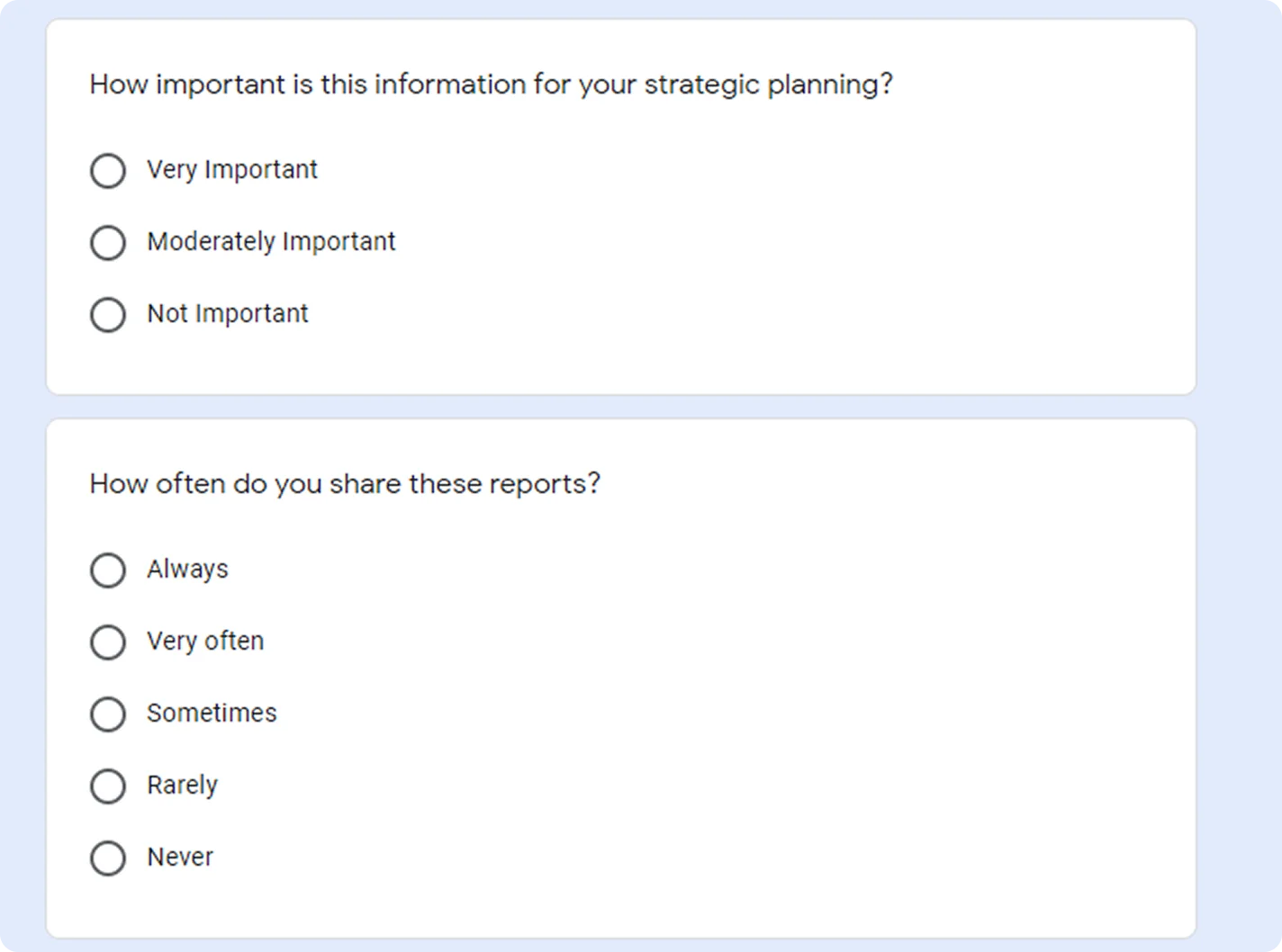
I interviewed and surveyed US-based customers from solo agency owners to enterprise marketing teams from companies such as General Electric, SalesForce and DHL. The user base was at least four audiences, each with fundamentally different needs. For example:
- A small agency needed templates and speed.
- A marketing analyst wanted self-serve data access.
- An enterprise marketing manager wanted shareable dashboards.
- A web designer wanted full creative control and preview environments.
A content-quota pricing model couldn't serve any of them. They needed different feature bundles at different price points, which spelled out a structural shift parred with a UI redesign.
Strategic direction
I presented findings to senior leadership and facilitated a remote workshop in Miro to align C-levels, VPs, and Directors across teams that had historically operated independently.
The CS team had built their workflow around being the intermediary between users and data. The sales team worried self-service would reduce upsell opportunities. The research had to show that the current model was driving churn rather than loyalty, and that users who actually understood what the product could do would pay more for it.
The workshop produced a framework that mapped user roles to feature based tiers, with feature access replacing content quotas as the organizing principle.
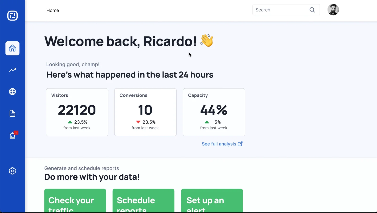
A new analytics experience
As users were now to be self-service, they could have direct access to everything CS had been interpreting for them, chefly the performance analysis. The home screen was redesigned into a dashboard with a 24-hour summary and direct navigation to traffic, reports, and alerts. Landing on something immediately useful reduced the activation gap: users who might otherwise close the tab had a reason to go deeper. The main analytics view put real-time traffic, source attribution, and content performance in one place, filterable by portfolio, campaign, creative, country, and date range.
Marketing managers could check campaign performance while a campaign was running, with up to the minute information readily available and shareable. They could make adjustments on the fly and, with more resources available due to the new feature gating model, experiment more and A/B test their campaigns.
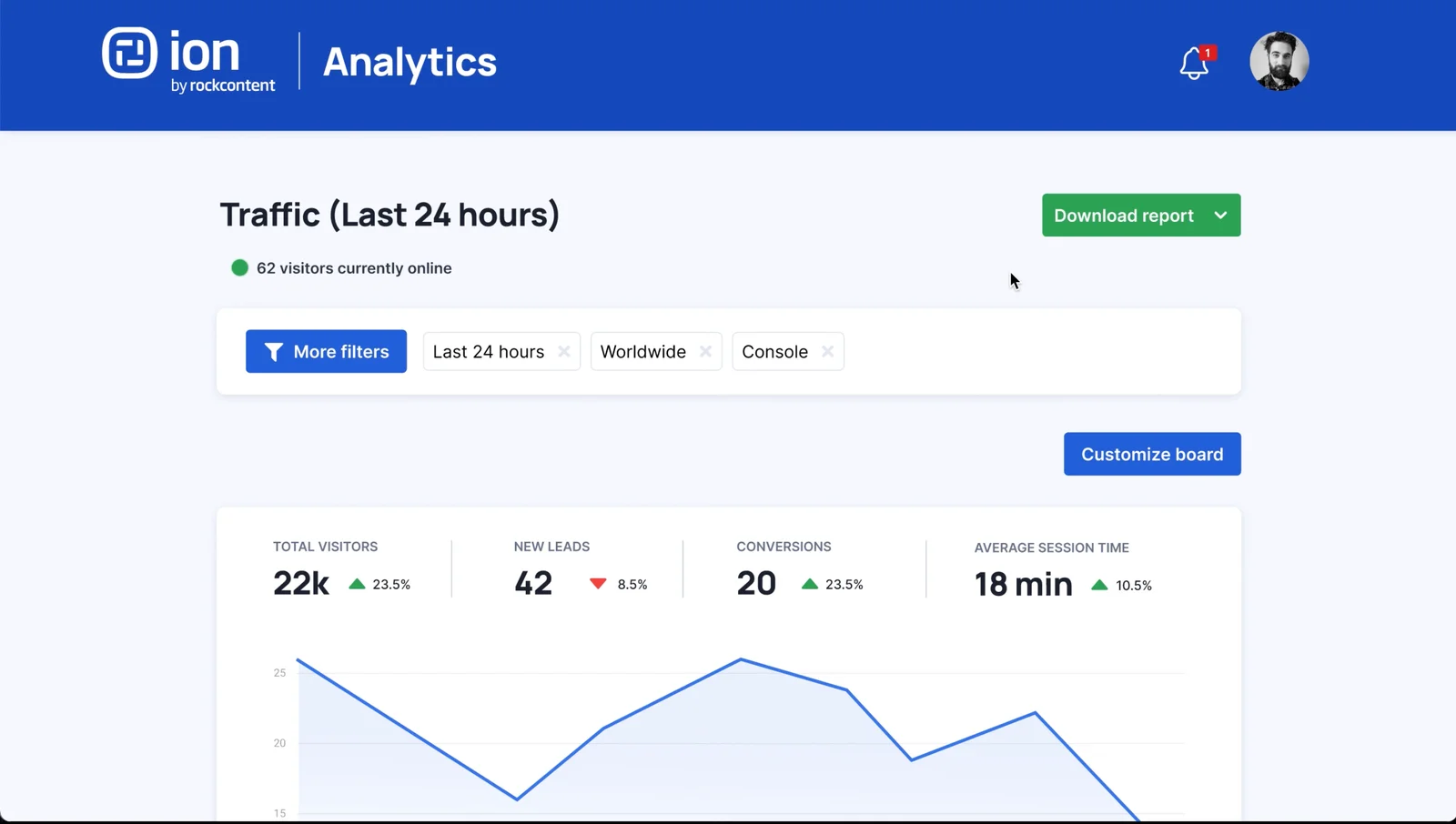
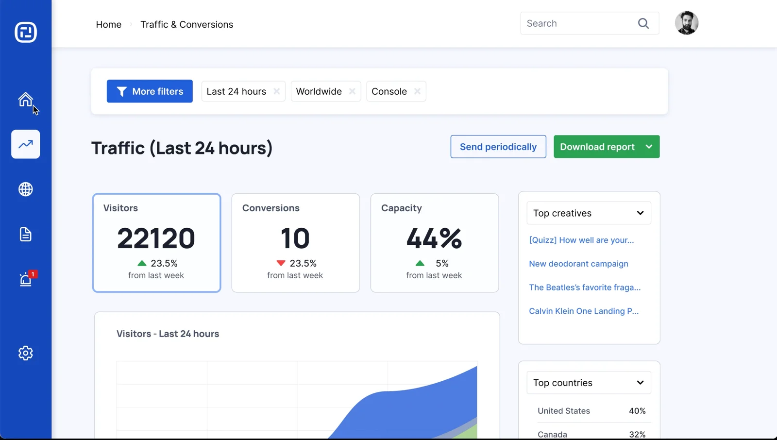
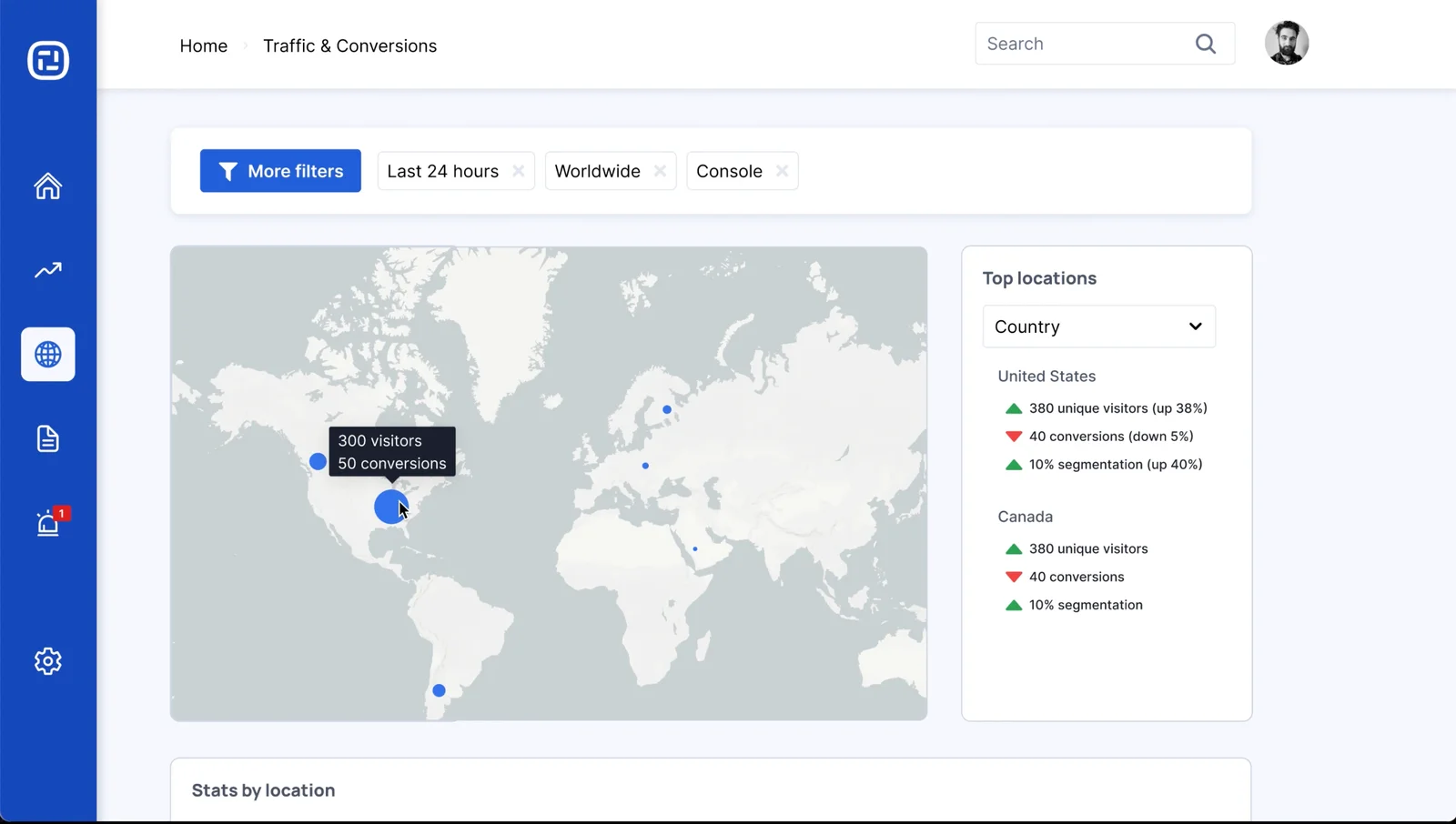
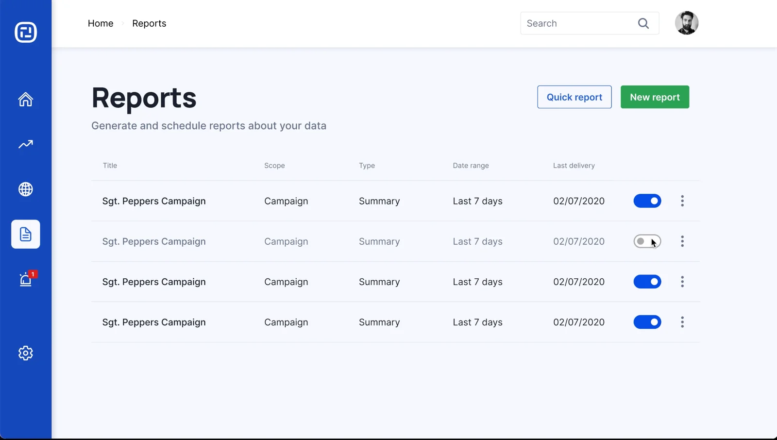
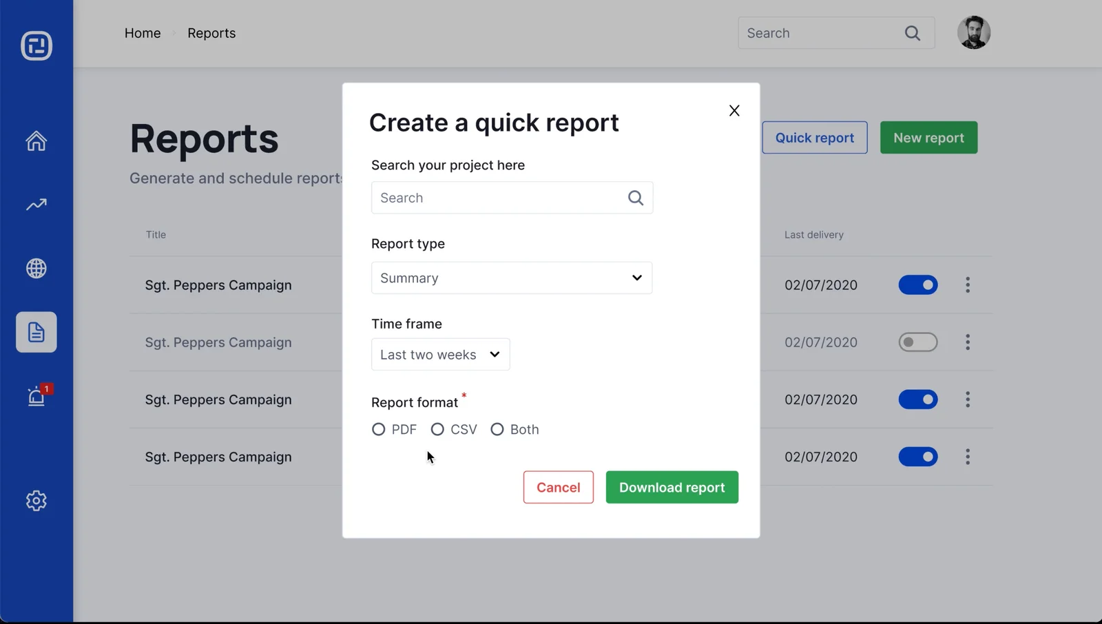
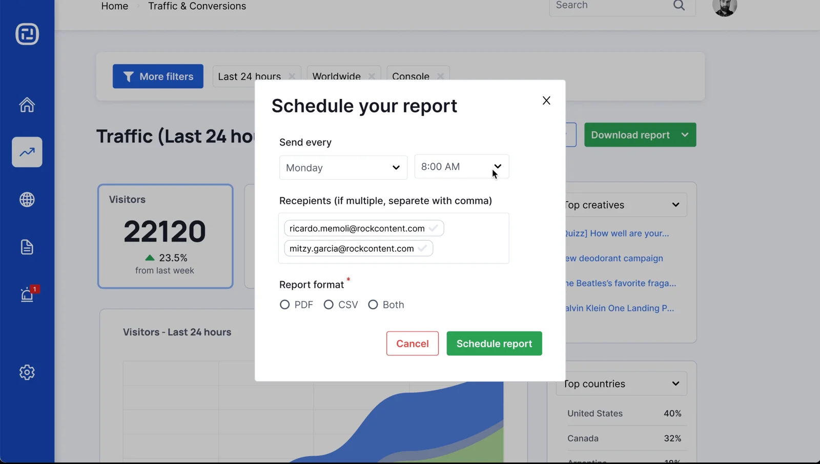
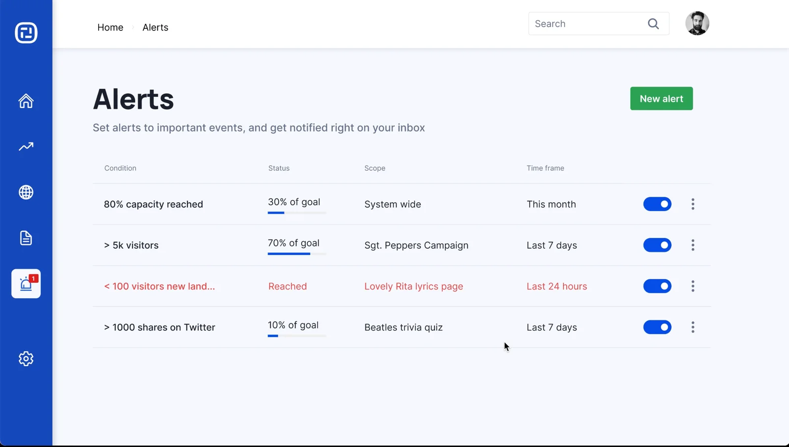
Some useful features that became key and highlighted new capabilities:
- Scheduled reports: let users set up recurring deliveries with their own recipients and timing, replacing a distribution list CS had been managing manuallym linking to a dynamic page built on top of Ion's interactive capabilities.
- Alerts: allow users define thresholds and notification frequency themselves, providing proactive notifications about the metrics that matter.
- Shareable analytics: gave teams a way to share live dashboards with clients without exporting anything.
Outcome
The new analytics experience launched in 2022 and was adopted by 100% of the customer base. The results were:
- +37% WAU
- 1.8× deliveries
- -58% CS time spent on delivery support
Ion Interactive has since grown into an independent company and continues to utilize the business model we designed then, being the only profitable company from the Rock Content portfolio.