Helping Stelloa bring AI into the job search
Stelloa is an AI engine for tech hiring and job matching in Denmark, matching candidates with the most relevant opportunities. Job seekers can browse and apply via the mobile app, and companies get a thorough job application manager.
I was hired as a consultant to design the end-to-end experience: information architecture, all user flows, a B2C mobile app, a B2B desktop dashboard, and a base design system. All in 10 days. What a ride!
The brief
Stelloa matches developers to jobs using an AI ranking algorithm. Developers get a curated feed. Companies get pre-qualified candidates without sourcing them. When the founders approached me, they had a working algorithm and a trial version with no design involvement. They needed a real product ready for Tech BBQ, where it would be offered to conference attendees for free. I had ten days to deliver so they could implement the designs in time for the conference.
I designed both sides of the marketplace simultaneously. A mobile experience fast enough to browse between conference talks, and a desktop tool thorough enough to replace a recruiter's spreadsheet.
Design process
B2C Mobile App
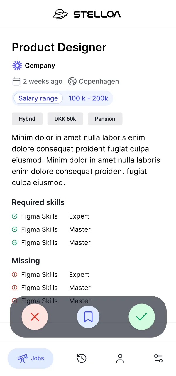
A job listing typically runs 500–800 words. I had to identify and fit the key parts into a single swipe card, which the founders referred to as "Tinder, but for jobs". Candidates could sign up through LinkedIn, pulling their profile data to skip manual onboarding. From there, they'd swipe through job cards, each one compressed to the few details that actually drive a decision.
Their early trial version showed company name, role title, a short description, and location. I cleaned up the layout, but the real question was information hierarchy. With desk research & conversations with my students at Redi School to draw on, I made calls based on a simple question:
What signals do people look for when deciding if a job application is worth their time?
I prioritized position, salary range, remote policy, company name & short summary on the card surface. The full description moved to the detail view, where it helps candidates who are already interested learn more. It's useful once someone is already interested, but it's not what creates the interest.
The onboarding flow pulls role, skills, and location from LinkedIn in one tap. Candidates land directly on their job feed with no manual setup. Each card supports three gestures: swipe right to apply, swipe left to skip, swipe up to save for later. Saved and skipped jobs move into a tracker tab, so nothing is lost and candidates can revisit decisions. Tapping a card opens the detail view: full job description, company overview, benefits, and a direct apply button. The AI match score surfaces here too, so candidates can see why a role was surfaced to them.
.webp)
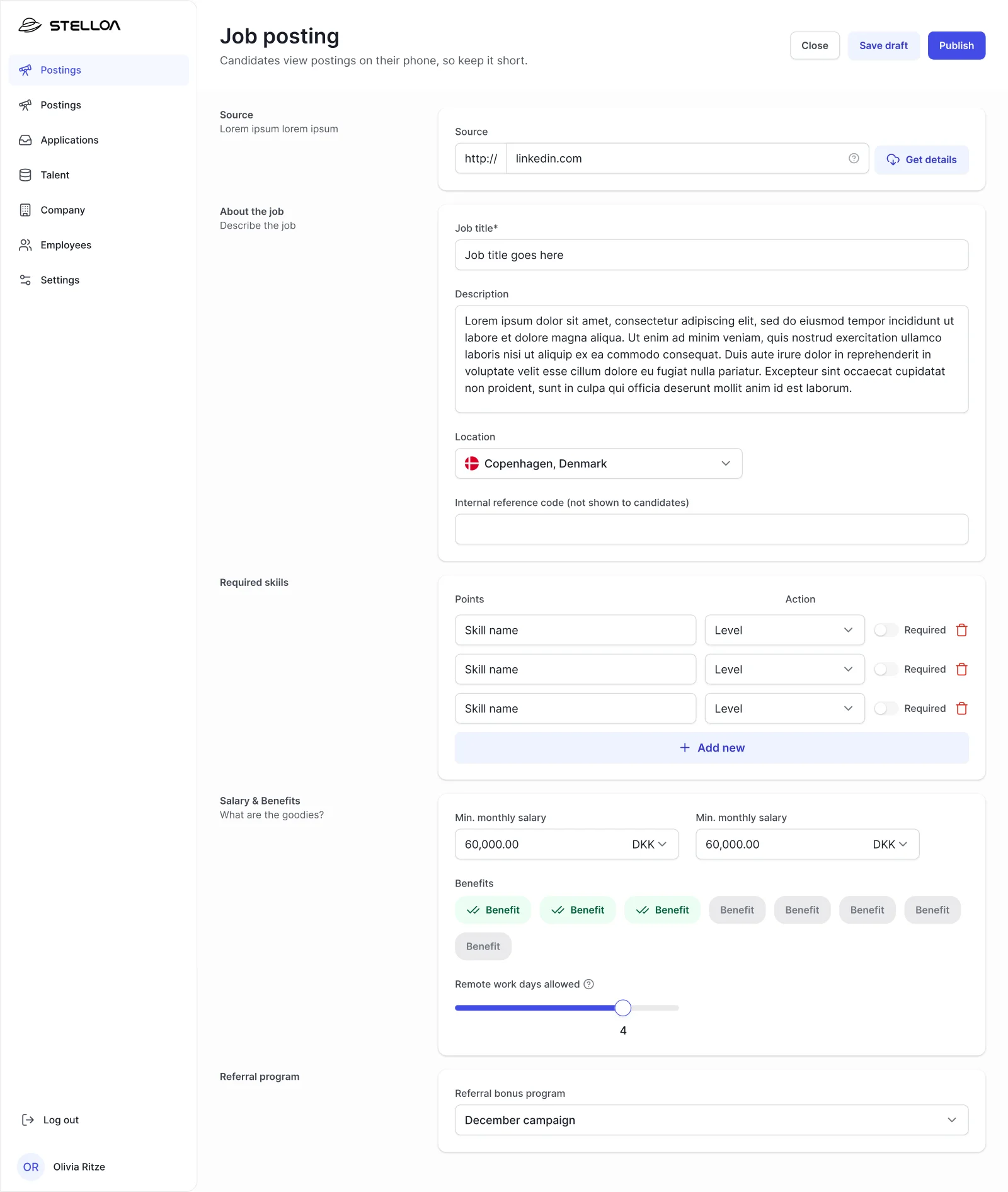
The company side
The desktop dashboard gave hiring managers a pipeline view of algorithm-matched candidates, with enough context to evaluate a match without opening a separate tab. I studied existing job matching apps and spoke with the founders at length about the market and their vision, as well as any data they had available that could help guide decisions.
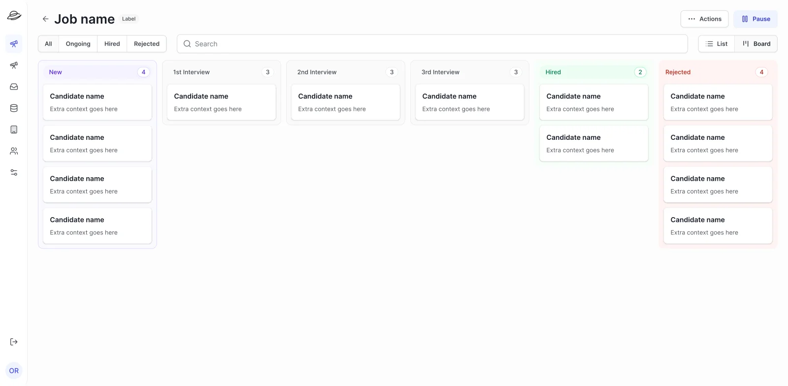
Hiring managers receiving algorithm-matched candidates needed to evaluate them efficiently without the overhead of a full ATS. Because candidates were pre-filtered, the volume was small enough to make a kanban work: hiring managers already think in stages, so mirroring that in the UI meant no learning curve. The focus could shift from managing quantity to judging quality.
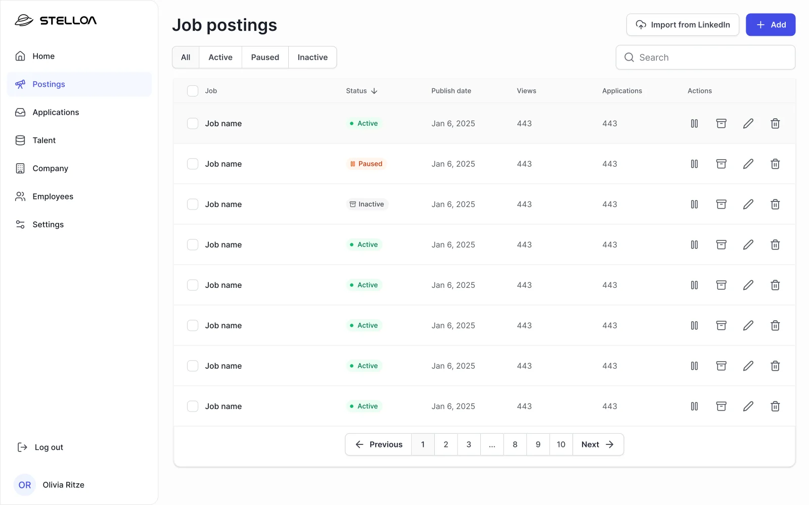
Job postings are created through a structured form: required skills, salary range, remote policy, and benefits. Free-text descriptions are too noisy for a matching algorithm to parse reliably, so the form design directly affects match quality. Clean inputs in, better candidates out. Once a posting is live, matched candidates appear in the pipeline and hiring managers move them across stages as conversations progress. This allows tracking and filtering of candidates based on their progress in the hiring funnel.
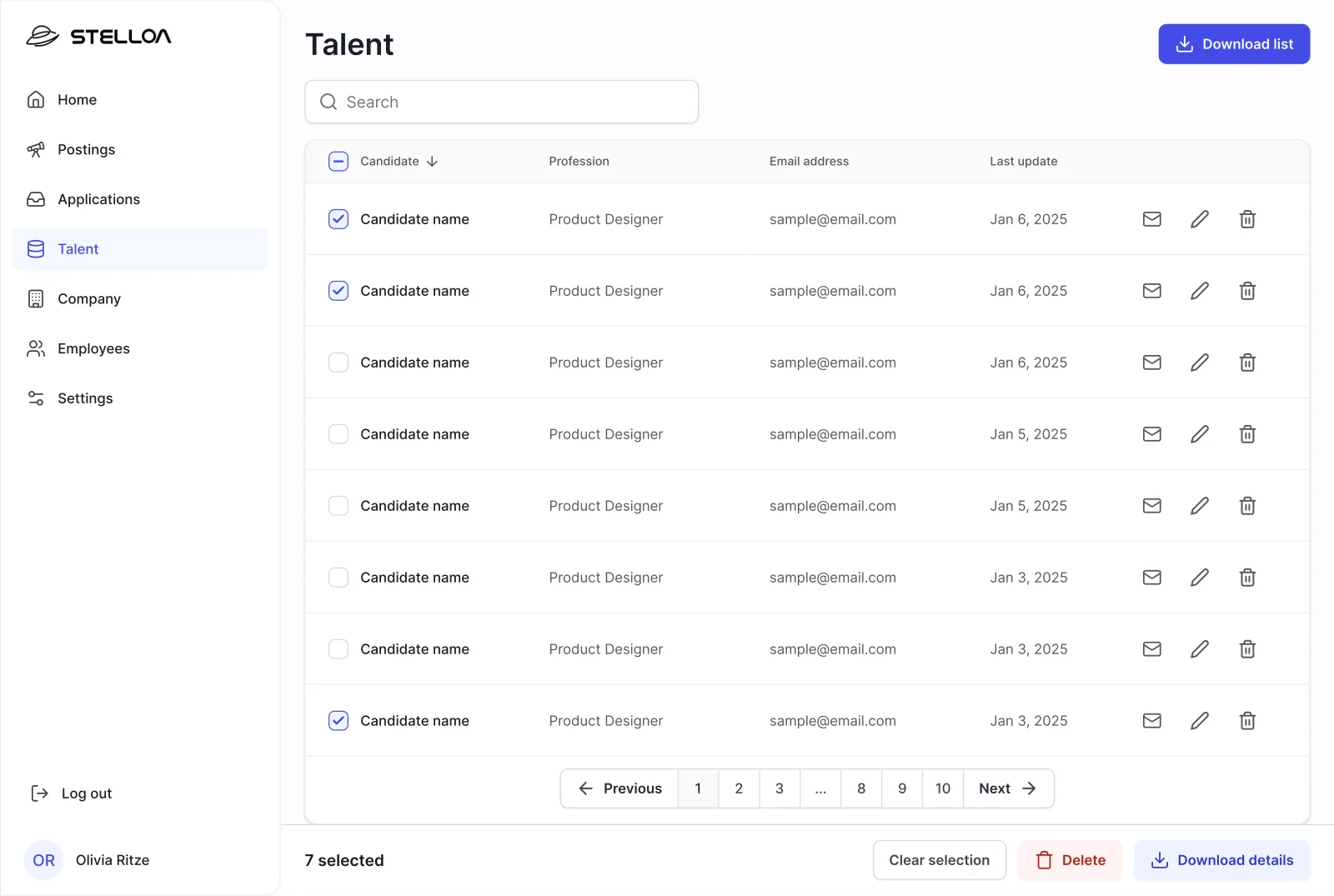
Each candidate entry opens a profile view showing an AI-generated summary alongside raw experience data and a skills match percentage. An algorithm-driven product only works if hiring managers trust it, and trust has to be driven by transparency. Showing the summary next to the underlying data means managers can verify the reasoning rather than accept a black box. A separate talent pool view lists matched candidates across every open role, because a strong candidate should not be invisible just because they applied to the wrong posting. Perhaps they would be a great fit for another role.
.webp)
Visuals and Design System
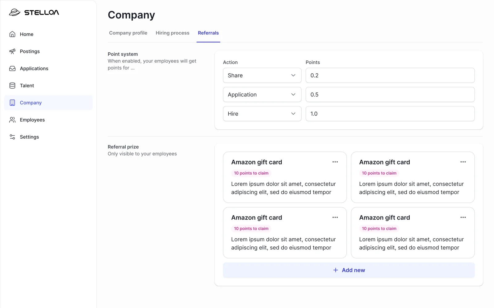
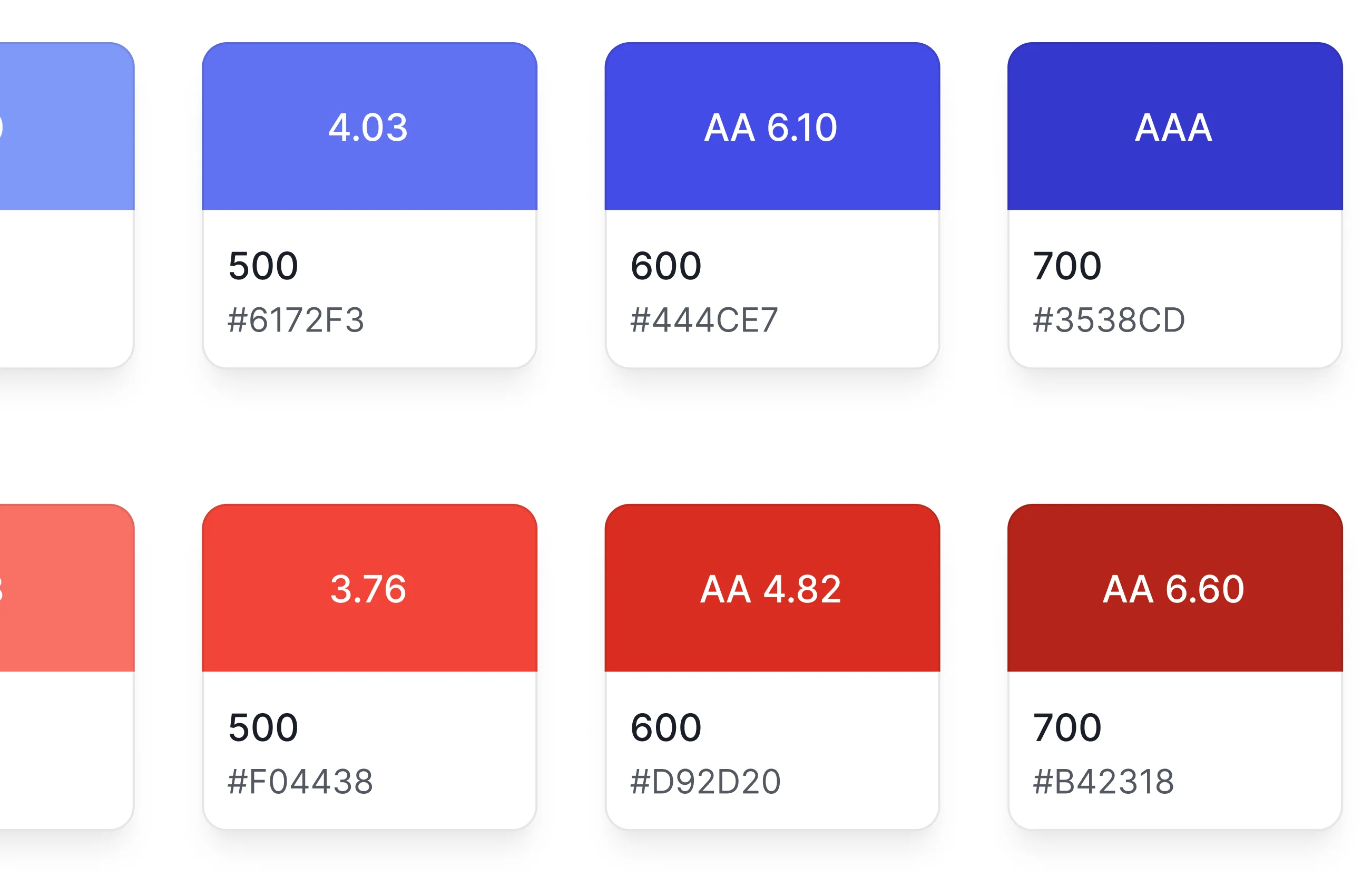
Stelloa had no brand identity at the time of the project, but they had been using a few colours informally across early materials. I took those as a starting point and introduced a vibrant blue as the primary action colour: distinctive enough to carry the product, exciting and fresh. The designs were delivered in both light and dark modes, each fine-tuned independently rather than just inverted. Dark mode was given real consideration since developers tend to use dark theming.
I built the design system as soon as I had mapped the screens, so components could be built once and reused throughout. Token-based styling meant that when Stelloa eventually developed their brand identity, they could reskin the entire product by swapping values at the token level without touching component logic. That is exactly what happened eventually: they updated the brand and the system absorbed it cleanly.
Launch
The app launched at Tech BBQ Copenhagen, where it was offered free to attendees and companies. Developers used it between talks to browse real listings. The venue was full of developers actively thinking about their next move, surrounded by companies in need of talent. Ideal conditions for a job-matching app. The feedback was consistent: people found it intuitive and fast. The card hierarchy worked the way I'd intended it to.
The launch and feedback confirmed the hypothesis that developers would barely glance at the description. They were making decisions in seconds based on salary, tech stack, remote policy, and company credibility. Even though it wasn't the focus, the aesthetic aspect got really good feedback from the users, who highlighted how intuitive and fast they found the app. Areas of improvement included certain bugs and the need for more job listings.
"Love the app and it's aesthetic."
— App Store review, initial release (before the brand update)